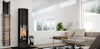

Interior design trends and fashion are shifting from cold shapes to warmth. During the 2010s, grey shades prevailed in the interior design landscape as an easy-to-match, natural colour. While the use of cool tones was initially considered effortless and elegant, it slowly became boring and sterile, easing the rise of cream and beige.
The trend initially started with fashion. The Vanilla Girl wardrobe delivers a sense of self-care and luxury, senses that slowly shifted into the interior design field with the Scandinavian interior style: minimal furniture shapes, functionality first, and wood as the favourite material.
This transition is driven by a need to be surrounded by natural colours. The inclusion of grounded colours in interior design seems to connect people with the natural world.
However, this does not include only plain beige: this colour is easier to alter by playing with layering, nuances, textures, and shapes. These trends are more complex than expected: freedom with essentials is the no.1 rule for a modern, warm-coloured house.
Transitioning from Grey to Beige: Why it Happened
The changing neutral colour patterns largely come from the historical period we live in. The 2010s have been a decade dominated by social and economic uncertainties. In this context, grey was a colour associated with a living space of withdrawal and rest. Everything shifted after the pandemic, as we were all forced to spend more time at home than anywhere else.
The rapid development of digital devices and tools led to the predominance of large, dark screens in living rooms and bedrooms. Our constant scrolling attitude and, more generally, addiction to digital devices for reasons other than work must be contrasted with a connection with natural colour, nude and warmer tones.
The role of houses has turned into a psychological sanctuary. As a matter of fact, warmer tones provide rest from daily overstimulation and the screens’ overexposure effect, so-called “visual noise”.
A warm palette engages the viewer in a calm environment and connects immediately to the natural world. The natural versatility of beige gives you the green light to excel with your creativity.
How to Recreate a Warm Environment with Wall Art
An original criterion for a successful recreation of a natural environment would be more complex than using a plain 2D beige canvas. Such a versatile palette can benefit from natural light, combined with shapes and textures, then giving your neutral wall art value.
Here are some trends to make your house welcoming and warm but out of the ordinary.
- Choose a consistent palette: different nuances of creamy beige in the same room make your room decor luxurious and not overcrowded.
- Work on hanging style: play with numbers and shapes you’d like to group your small neutral paintings.
- Take advantage of three-dimensional mediums: gesso canvases, hand-woven textile tapestries in wood or vintage fabrics are strongly textured and help bring the roughness of natural materials into your room.
- Use the physical light dynamic: beige curtains act as a filter for sunlight. The light is softened, leveraging neutral painting with nice games of light and shadow.
- Play with frames: slim, good-quality wooden frames give a touch of elegance to your neutral environment, yet stay consistent with a natural purpose.
- Use landscape and animal subjects: stylised random paintings, reminding of trees, flowers, and mountains in sepia-tone shades, naturally evoke Earth-related themes.
- Layer with green and brown shades: colours found together in nature will spontaneously connect indoor spaces with the natural world.
- Use antireflective glazing: matte finishing avoids annoying, heavy reflections on your neutral paintings.
These are just some examples to combine different colours and shapes. You can really enjoy the creation process.
Suitable Rooms for Beige: The Psychology of Colours
Beyond the mere aesthetic point of view, colours can optimise the intent of every room in your house.
Neutral and earth-connected colours are for calm, peaceful and concentrating environments. This can easily be suited for a work-from-home space: beige works efficiently in absorbing visual noise and making focus moments easier.
Also, it fits well in a living space as a source of relaxation and peace after getting back from work. It has become the one place where stillness really matters.
A warm, nature-inspired palette offers exactly that: quiet, grounded beauty. Beige doesn’t demand attention and always feels quiet. Whether you start with a single wall or a full room, beige invites you to relax.